Bally Sports, Please Shrink The Score Box
The clock struck midnight April 1st and Fox Sports Wisconsin magically transformed into Bally Sports. The name “Bally” returns memories of Bally Total Fitness; a fitness center I never went to with locations around Milwaukee that apparently became very shady before going bankrupt in 2016. While I held a neutral opinion of Fox Sports overall, among the various sport broadcasters they had the best score box and provided a pleasant viewing experience for Bucks and Brewers games.
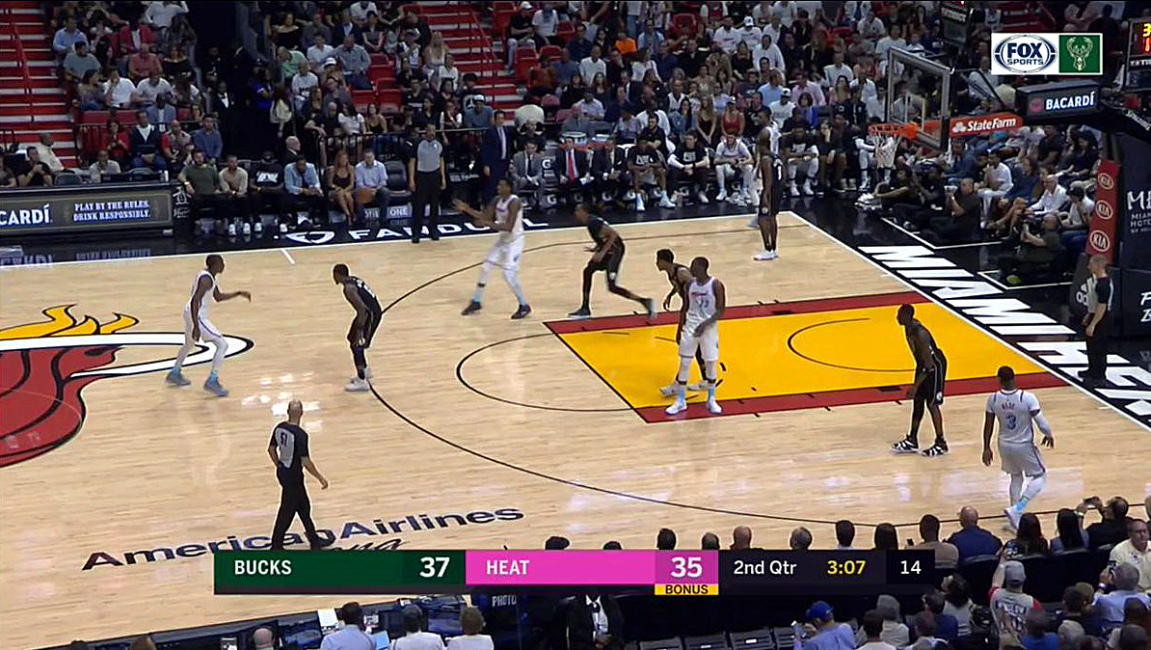
Their graphics left space all around the score box leaving it to float towards the bottom of the screen; thus removing the “lets eat up 1/5 of the screen found elsewhere (I’m looking at you ESPN.) I see no need for the Fox Sports and Bucks logo in the upper right but what can you do?

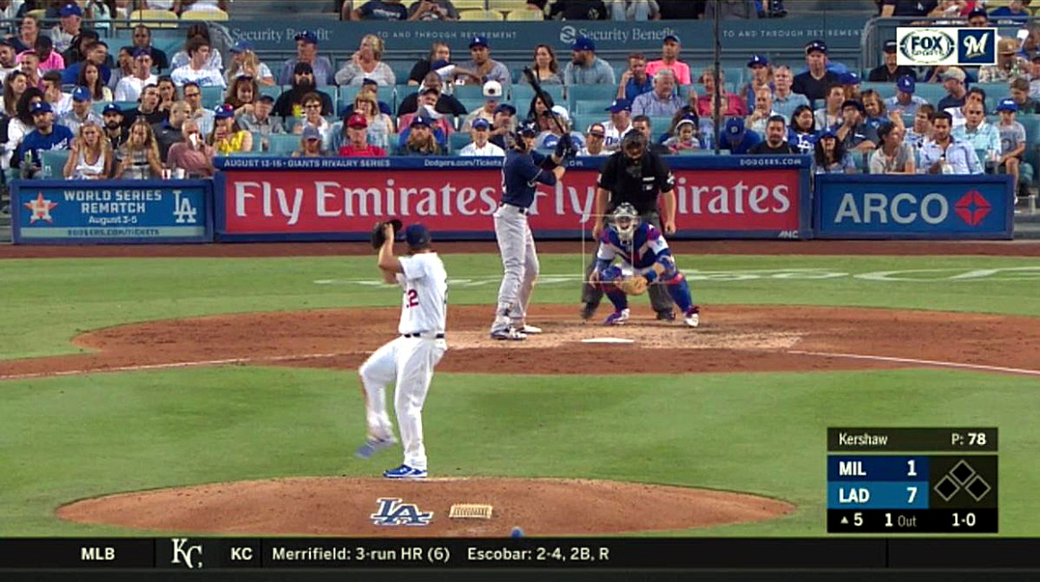
A similar display existed for the Brewers; all of the information I want provided within a tidy, compact box that stays out of the game's way and avoids unnecessary distraction.

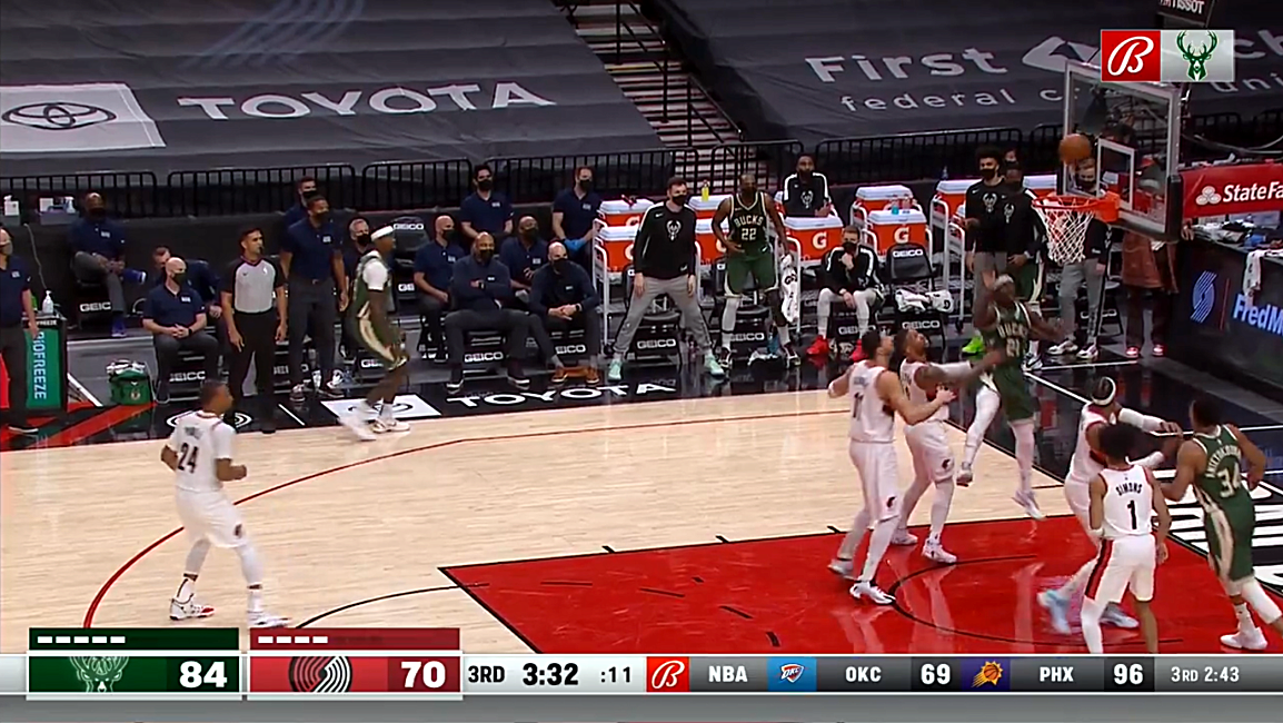
Unfortunately, all was lost during the transition to Bally Sports. They introduced themselves with a big honker of a score box/ticker combo that changes ESPN’s two level score box/ticker into a one level behemoth without reducing used screen space 😖.

The color scheme is an improvement over ESPN but I wish the ticker were removed entirely. I’m more interested in seeing the hitters count at all times rather than how the Rockies are doing (Boo Rockies?) The world only needs a single Bally “B” logo on screen at once so how about dropping the upper right corner logos? I know I’m watching the Bucks or Brewers because their logo or name is next to the score so the extra reminder in the corner is superfluous.
Hopefully some day Bally will revert back to the more pleasant presentation of March 31 and I can get back to screaming at the Fox Sports Go app on Apple TV that crashes constantly and requires me to login to my account every time the Bucks take a shot. I am legitimately very excited to see Bally Sports' promised upgrade to their apps. They have a very low bar to step over.